Wednesday, 26 April 2017

My Module Evaluation (OAUN401)

This module went well, but I thought my biggest weakness was my lack of time management. I left a lot of the work too late which means I didn’t have time to properly proofread my final essay to ensure I had met all the criteria. Also, had I put more thought and research into my sketchbook work from an earlier stage, I would have been more inventive with my drawings and explored a broader range of topics related to my theme.

Having said that, I’m pleased with my sketchbook. I think it has a unique tone and a couple of actually funny parts. The best decision I made was to ditch my first concertina and restart it over two-thirds of the way through the module. The first concertina was lacklustre, I felt. I went for a variety of tones varying from comedic to abstract and very visual to slightly more serious, which was nice as it shook up the formula from page to page, but in drawing so many different snippets of ideas I felt that I never allowed myself the chance to really explore one as a train of thought, which meant I never leapt far from my initial quote. In next year’s module I’d like to take one idea and develop on it.

So, on one hand I felt that I didn’t convey a wide enough range of topics/styles and on the other and I’d have liked to further explore just one topic/style.

The essay went well, with the interim feedback proving to be really helpful to ensure I wasn’t flying off the straight and narrow. I didn’t devote as much time to the third 1000-word segment as I’d have liked to, but I feel it was concisely written and justifies my practical body of work well. Essay writing is certainly one of my stronger suits. I’m happy that I have found a writing style that works and I look forward to developing it further in the next module. I want to make it more concise and use a variety of sentence lengths that give a sense of rhythm to the piece.

I’m also pleased with my animation proposal. It links well to the concertina stylistically as well as tonally, and I put a great deal of thought into the symbolism behind the characters and the colour scheme. I also feel I justified these choices by linking them back to my research, evidenced in the essay.


The most important thing I’ve learned during this module is the value of research. It’s inspired me to seek out new artists, observe more around me and sketch more. I appreciate how this module, especially the lecture programme, introduced me to cultures and artworks I’d never have discovered ordinarily which give me so much more to draw from. I enjoyed the lectures, even the ones that weren’t so specifically tailored to my area of study because they made me think about art outside the bubble of simply animation. I attended the lectures and blogged them consistently, although my blogging in other areas of the module, such as my keeping track of my general progress, has had a tendency to be sparse.

Tuesday, 25 April 2017

3000 Word Essay (OUAN401)

Here's a link to my 3000 word essay!

https://issuu.com/christopherhoare/docs/final_essay

Reflection and Proposal (OUAN401)

My reflection and proposal documents my general overview of this module as well as explains my plans for next year's project!

https://issuu.com/christopherhoare/docs/reflection_and_proposal

My Image Sequence (OUAN401)

MY SIX TO TWELVE FRAME IMAGE SEQUENCE


WGSN - Global Trend Forecasting (OUAN401)

I listened to a podcast named 99% invisible, which ran an episode which I found really relevant to my area of study. It discussed WSGN, a company that predicts what will be popular in years to come and then sells that information for inordinate sums of money to huuuge companies.

This company predicts all sorts of trends, from fashion to interior design to hospitality and food and beverage.

This is important because so many companies use WGSN's services, which means they're all getting the same information and as a result, a lot of the stuff sold to us on the high street all looks the same.


It made me think about how we regular people have no clue that we are being manipulated by large companies. All of us like to believe that we are INDIVIDUALS WHO defy the trends, but we are almost certainly being SUBCONCIOUSLY manipulated.

This inspired me to devote a large portion of my sketchbook to conveying the theme that humans are being manipulated by some unseen force.


Naomi Klein - No Logo (OUAN401)

At the recommendation of my tutor, I checked out Naomi Klein's book "No Logo". It seemed to be a really great setting off point for studying how massive corporations dominate the planet, being an international bestseller and seemingly the manifesto for any critics of unfettered capitalism.

I read parts of it, and it was incredibly insightful and unpatronising! I especially liked the way that she documented the historical rise of brands and how in the 1980's marketers changed their approach from targeting the baby boomers to targeting the youth demographic.

It's a tad outdated, being initially published in 1999, but its message is timeless

She makes excellent points on the destructiveness of corporations that are simply machines programmed to make money at any cost to people and the environment. I know it's hardly an original point of view, but it inspired me to draw large, looming, faceless ghouls to represent shadowy corporations. 


Monday, 10 April 2017

Backgrounds for the 12 Frame Thing (OUAN401)

Man, I had a really tough time deciding on backgrounds. I wanted to make it minimalist so as not to distract from the main thing that was going on, but also I wanted to make it mean something SEMIOTICALLY. Every other element of the storyboard is steeped in GREATER MEANING. The colours represent factions of society, the apes represent the primal nature of man at his core. If I chose a background purely because it looks nice without any other purpose, it could remove the tenability and cogency of other aspects of the storyboard. Like, if one aspect of it doesn't mean a specific thing, why should any of it?

I checked out "The Dot and the Line", a kind of abstract Chuck Jones animation from 1965 which has really minimalist backgrounds. For most of the animation, it's one block colour that changes depending on the mood or the pace of the story.


This is the most detailed it gets. Big spiky lines and shapes


I ended up going with very simple, single coloured backgrounds based on this animation that change based on the mood or pace of the story.


It starts off with a coool, relaxed background

Explaining The Meaning Of My 12 Frame Proposal (OUAN401)

I am basing my pitch on the Albie Sachs quote that “All revolutions are impossible until they happen, then they become inevitable” because I like the idea that revolution is destined to happen at some point, as history has proved. This sort of contradicts the Marx quote I'm studying that talks about the upper echelons of society dictating how everything works. It offers an alternate perspective that says "ACTUALLY, Karl Marx, the people will only be controlled so much before revolution happens."


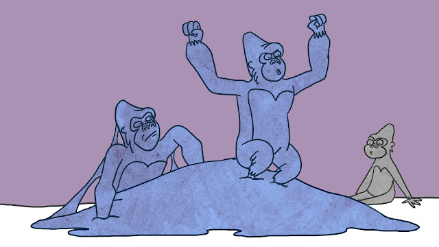
I was inspired by (STOLE) the plot of "Animal Farm", the MOTION PICTURE. Specifically the part where the revolution happens but then at the end another revolution happens because the revolutionaries from the first revolution just ended up becoming an oppressive government like the one they overthrew in the first revolution. It made me think that this is just the way that society works. There is always going to be another revolution eventually because there will always be a group in society who are the scrappy underdogs. I manifested this concept in my 12 frame pitch by having the two apes locked in eternal battle, changing colours to represent the balance of power shifting forever.


Red = The working class
Blue = The ruling class

I chose those colours because that's what they mean on the French flag


In the peer review discussion, someone asked "why apes?" and I was like "why don't you MIND YOUR OWN F**KING BUSINESS". At first, I just used apes because cartoon apes would be a lighthearted, funny way to convey my theme. Apes are funny, right?


Look at this adorable little scamp

But having said that, the primal, no holds barred nature of the ape represents how humanity works at it's CORE, stripped of sophistication and social constructs, which I can relate back to my theme. The reaction of the ape to being provoked by that little blue spear thing is a great way of conveying how revolution stirs amongst the disadvantaged of society, only this is much more literal and simple. It's a very simple representation of revolution.


The small chimp was red in my first draft, but I made it black. While the larger apes represent the people; the underclasses and the elite classes, the small black ape represents religion. Religion is a constant, unchanging presence in society no matter who is in power.

I got the idea to do this from Animal Farm THE MOTION PICTURE again. In that film/ booook, Moses the black crow represents religion and is a constant neutral presence. I wanted to add that kind of depth to my storyboard.

To quote Paul Garfunkel in that song "The Times They Are A Changing", "The Times They Are A Changing".

Monday, 3 April 2017

Peer Review Session - Pitching Our Image Sequences (OUAN401)


It was handy to pitch my concept for an image sequence to a couple of peers and I got some cool feedback and useful questions. For instance, while the colour scheme of the characters works well, my backgrounds are really sparse and I should think about what I want to do with backgrounds and what the significance of them should be.

I got good feedback about the subtext of the storyboard. The battling apes, constantly locked in a power struggle, represent how societies cycle round in constant revolution, where the revolutionaries overthrow the government, become the government, and are overthrown again by more revolutionaries. Then the cycle repeats infinitely. It's INEVITABLE. I was told that the apes were a fun way to convey a more serious subject matter.

Unrelated to this (but still part of the same session), my tutor gave me great inspiration for my visual journal by talking about how large MASSIVE companies like McDonalds or Coca Cola dominate our lives without us knowing it by purchasing smaller companies. For instance, like, if I didn't want to buy a Coca Cola product because Coca Cola killed my family or something, I might instead buy a bottle of DASANI water. But then SOCIETY would tell me that I'm danged outta luck because DASANI is owned by Coca Cola. So how can anyone be an ethical consumer without spending inordinate amounts of money on an artisanal soft drink brewed by hippies or something? It's hard, man!

That's how big companies control the world. anyway.

It fits in well with the theme that the elite in society dictate how society thinks. He recommended that I check out Naomi Walker's book "No Logo" for ideas, which was useful.

Knowing what I now know I'll continue to develop my concept. I'm pleased with how well my initial draft was received, although I would've appreciated a little more constructive criticism.

Friday, 31 March 2017

Conceiving my 12 Frame Proposal (OUAN401)

I knew that I wanted to do something a little abstract, with a subjective meaning, for my 12 frame proposal. I mean, not TOTALLY abstract. Lord knows I haven't done enough MIND BENDING DRUGS to venture into that territory yet. The topic of how the social elite run the world has been covered a lot across all art forms, and I wasn't keen on making anything with a blatant message of how we should be all out fighting the revolution or something like that. Firstly, it would be hypocritical of me as I'm currently doing naff all to aid in the revolution, even though I probably should be out firebombing the post office or something.

Secondly, I want to make mine light hearted. I ended up going with an concept about cheeky cartoon apes and while it does have a deeper subtext, it can be fun on MULTIPLE LEVELS. That's what I meant by wanting to to be subjective.


Just like how Watership Down can be interpreted as a wacky comedy where the joke is that the animals can talk. HOW CAN THEY TALK LOL?

Anyway, I experimented a teeny bit with colour earlier, which is where I got this idea. I began with the VERY BASIC concept that RED = underclass and BLUE = social elite. That is what those colours represent on the French flag. It looks pretty ugly because I only just slapped some colours on it, but the THING TO NOTICE is that I made everything sort of an amorphous blob with slight details, so the colour and expressiveness are the most important parts of these drawings, which I want to convey in my final 12 frame proposal. It's a teeny bit abstract.


Colour should play an important role in my final thing as it's very emotive and it has a bunch of SYMBOLISM behind it. Red is so often associated with wild revolutionary firebrands, while the colour blue reminds us of, well, blue-bloods. The lame aristos and stuff.

Wednesday, 22 March 2017

Lecture - Semiotics (OUAN401)

Boy, this lecture was a bloody brain boozler. No wonder film students are all depressed weird nerds when they’re forced to analyse every aspect of every prop, set, sound effect and line in a scene of a film.

Semiotics – the study of signs. Every sign consists of the signified and the signifier. The signified is the concept, the meaning, the thing being represented by the signifier.

For instance, if the concept is good and evil, the signified in this case, we would signify that with a signifier, such as a dichotomy like white and black. This kind of stuff is taken into consideration all the time in films. What is the best way to convey a mood or a theme by signifying it with colours, sounds, props or dialogue to give it the best dramatic impact?

It’s relevant to animation because animation is just filmmaking for people who are too shy to ask for real life filming location permits. Also we never learnt how to use boom microphones.
It’s important because every prop used in an animation needs to be carefully considered, otherwise what’s the point mate? What’s the bloody point in anything? In LIFE? One of my biggest fears in life aside from dying alone and dying with someone is my fear that I will go on to design really generic looking film sets.

Well, it’s not one of my greatest fears. It’s one of my moderate fears.

Well, it’s something I occasionally consider

Well, it’s something I’ve never given any thought to until the writing of this blog post

What I mean is that unless every prop and background in a scene is considered from a semiotic perspective, it can look bland. If I had to design a spooky castle I could just throw in bats, cobwebs, wall sconces and suits of armour, but it’s not thought through and it’s boring!


I'm sure that there are well thought out design choices behind both of these spooky castles, but it would be wrong of me to just copy them

I would have to consider stuff like:

What’s living in the spooky castle? What kind of marks would they leave?

How long has the spooky castle been abandoned/ inhabited for?

When was it built? What era?

How often do strangers visit the spooky castle? What happens to them?

If I consider all this and more, then I can use my props and background design to help build up a story behind the location. Every prop should tell a story, everything is in the place that it’s in for a reason.

That's the main lesson I took away from this lecture. Semiotics give things PURPOSE.

Wednesday, 15 March 2017

Ditching my Old Sketchbook (OUAN401)

A few weeks back I decided to completely restart the sketchbook I'm developing themed around Marx and Engels' belief that the ideas of the ruling class are the ruling ideas. I realised that this was a tad RISKY. What prompted such a crazy and far out decision? Well, I dropped my first sketchbook down a storm drain and couldn't get it out so I had to get another.

Nah, that's not true.

I felt that I hadn't realised the full potential of the sketchbook and that, had I submitted my first sketchbook, I would have wasted an opportunity to really explore the concept with various design choices and abstract stuff and things like that. I felt that my last sketchbook was too cartoony without really delving into the meat and two veg of the quote. And cartoons are for kids, man! If I were a real artist I would draw a picture of Karl Marx on acid using my own blood or something like that.

ONLY JOKING BECAUSE cartoons are fine I suppose, but my biggest problem before was that I was very aware that the issue of the social elite dictating the thoughts of society has been commented on by, I dunno, about FIFTY BILLION ARTISTS in the past. I didn't want to make the same points that had been repeated so many times before, so I took the route of commenting on the issue in a snarky, ironic manner so as to distance myself from the other people.


At first I found it hard to make a statement about the ruling class without resorting to these kind of clichéd tropes
And these really blatant, patronising metaphors


But after a while all the snarky ironicness made me annoy even myself. I'm going to transfer some ideas from the previous sketchbook to the new sketchbook, but I want to start thinking more about what I'm really trying to say. I'll use the power of SEMIOTICS.

What am I signifying? What colours do I use to signify it? What objects? Quotes? The possibilities are limitless. I'm far more optimistic about the new sketchbook.

Modernism in Animation - Laszlo Moholy Nagy (OUAN401)

The lecture programme is cool because it shows me a whole bunch of stuff that I'd never normally find out about of my own accord, such as the Hungarian modernist animator and artist Laszlo Moholy Nagy. His middle name is "Moholy", which sounds a little like "holy moly".

Nagy experimented with loads of different mediums and was a massive modernist modern man, advocating for the use of technology to improve art.

I'm not quite sure what his films mean. They're very abstract. His film "Ein Lichtspiel Schwarz Weiss Grau", or "A Light Play Black and White Gray" according to Goog trans, uses a lot of light tricks, shadows and steady camera movements to create an entrancing effect.


I like the film because it's completely off the wall, detached from reality but with a sense of familiarity. The strong silhouettes and the occasional hint of something recognisable flashing up on screen, like curtain blinds or shiny metal, combines with the bright light that makes the animation feel dreamlike. It's like recalling a memory from early childhood.


I wonder how on earth Nagy was influenced to create it. The shadows blend into each other wonderfully seamlessly, and I'd love to try something inspired by this medium, purely to experiment with camera techniques and what kind of atmosphere can be achieved with light, shade and contrast alone. I think it's bloody brilliant!


Modernist animation is designed to be for everyone. It's universally understandable and stripped down, which I really appreciate.

A light shining through a board with holes in it